There’s been loads of work happening behind the scenes at Chez BS. That’s the name I just made up for our apartment. We’re not working on the apartment…well, we did just paint one wall yellow recently thanks to my awesome friend who gave me a “wall of paint” for Christmas… but what I mean is, we’ve been working on our businesses.
Zsolt is still piecing together Easy-Patent. There’s a lot to be done as a start-up business. One very important thing is to get clients. He’s working on that. Another very important thing is to have a professional online brand. I’ve been working on my identity online, too. There’s me as a writer, blogger, bumpyboobser, self-publisher, book lover, Ottawa liver, traveller lover, crowd funder… so that’s all a little bit scattered. My challenge is to unify those identities online. (Since in ‘real life’ they are already unified, as in – all of it comes in one package: me, Catherine)
In both cases, a very good starting point is to have a very good website. So that brings me to the point of today’s post. A little while back, the Zsoltster discovered a website builder called *Strikingly. We’d been using Wix and Weebly before this, and they were nice – but Strikingly truly does appear striking on the screen in a way that others haven’t yet managed. You know how all the cool websites have these beautiful scrolling features? Strikengly’s like that.
Anyhow, Zsolt went ahead and began building his Easy-Patent website there one day while I was away. When I got home later on, he showed it off and was really, really proud. One, it is always adorable when a loved one is really, really proud. And Two, it looks great. (Kinda hard to believe he could do something so lovely online without me there to guide him. But there you have it. The man did good.)
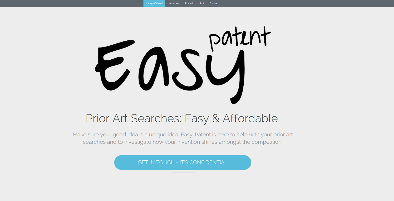
So, he has this gorgeous website ready to go, and because of that he is feeling a lot more confident in his brand. By the by, check out this awesome infographic I designed for him to send to clients. That’s another post for another day about the awesome infographic building program I used.
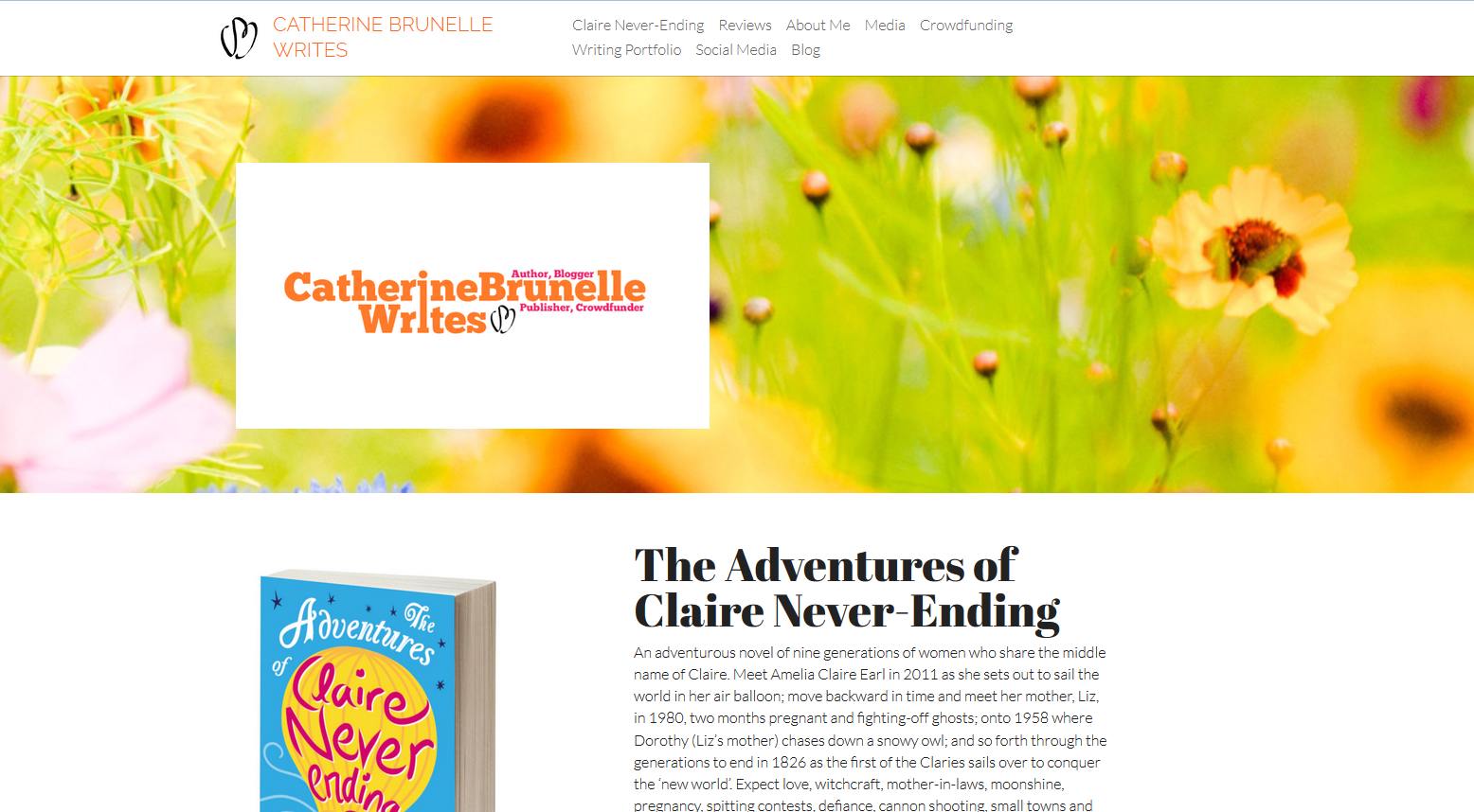
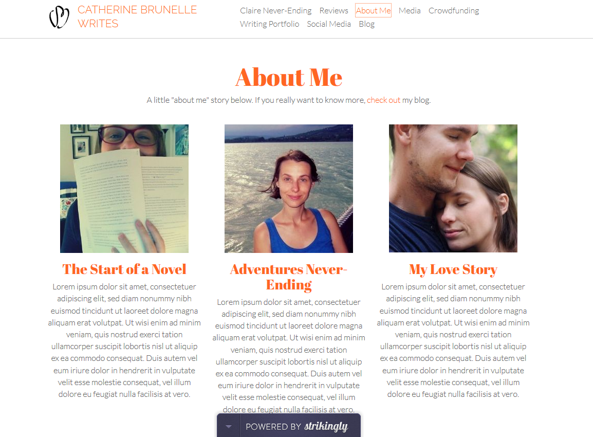
CatherineBrunelle.com is getting a makeover as well. As Marie recently told me, I need to bring together my different stories in one place. That place is going to be my touchstone online. So, like Dr. Z (i.e. the Zsoltster), I started building my website on Strikingly. It’s not done yet, but if you want a sneak peek – check it out here.
It’s so easy to start creating all these different projects and stories online. And because it’s so easy … blog idea – poof! It exists! Ebook – poof! It exists! Globe circling book tour – poof! No, just kidding on that one … because it’s so easy, it’s also easy to end up with fragments of one’s self all over the place.
In making these touchstones for our businesses, I feel like we’re growing up online. My only qualm, which is a big point to note, is not being able to bring the blog Bumpyboobs into the new website. But maybe one day 🙂 Until then, it remains where it is, since it’s doing such a fine job.
*Anyhow, we enjoy using Strikingly so much, that we decided to go pro plan. That’s a big deal for us. I never go pro plan. But just before doing that, I found myself an opportunity to exchange a year’s worth of free pro plan service for one little blog post on this business that I already loved. So, here it is!
Now how is that for growing up in the blogosphere? Someone wants me to write about them? Okay, I’ve gotten that before with random mailers, but in this case – I’m super excited!
So, new websites and stories coming together 🙂 2014, I am hopeful.
*I should say that Wix is useful in that it has some nice layering options and flexibility, though the text sizing ticks me off to no end! Weebly is good for multiple pages and a blog (super useful) but the templates are starting to get dated. Strikingly‘s basic plan has good options (though limited in how much can be changed), while the pro lets you play with html, which will be empowering – but even at the basic level, the interface is clean and doesn’t spasm with the text input – sparing us some arguments as I write copy for Zsolt – plus the design is really fresh. What it needs is a way to bring in one’s blog, and then it would be like the super hero of web builders. I was asked to give a review of my experience in exchange for the pro plan, so there it is pros and cons! Obviously I find it very much pro overall. It’s fraking beautiful.

